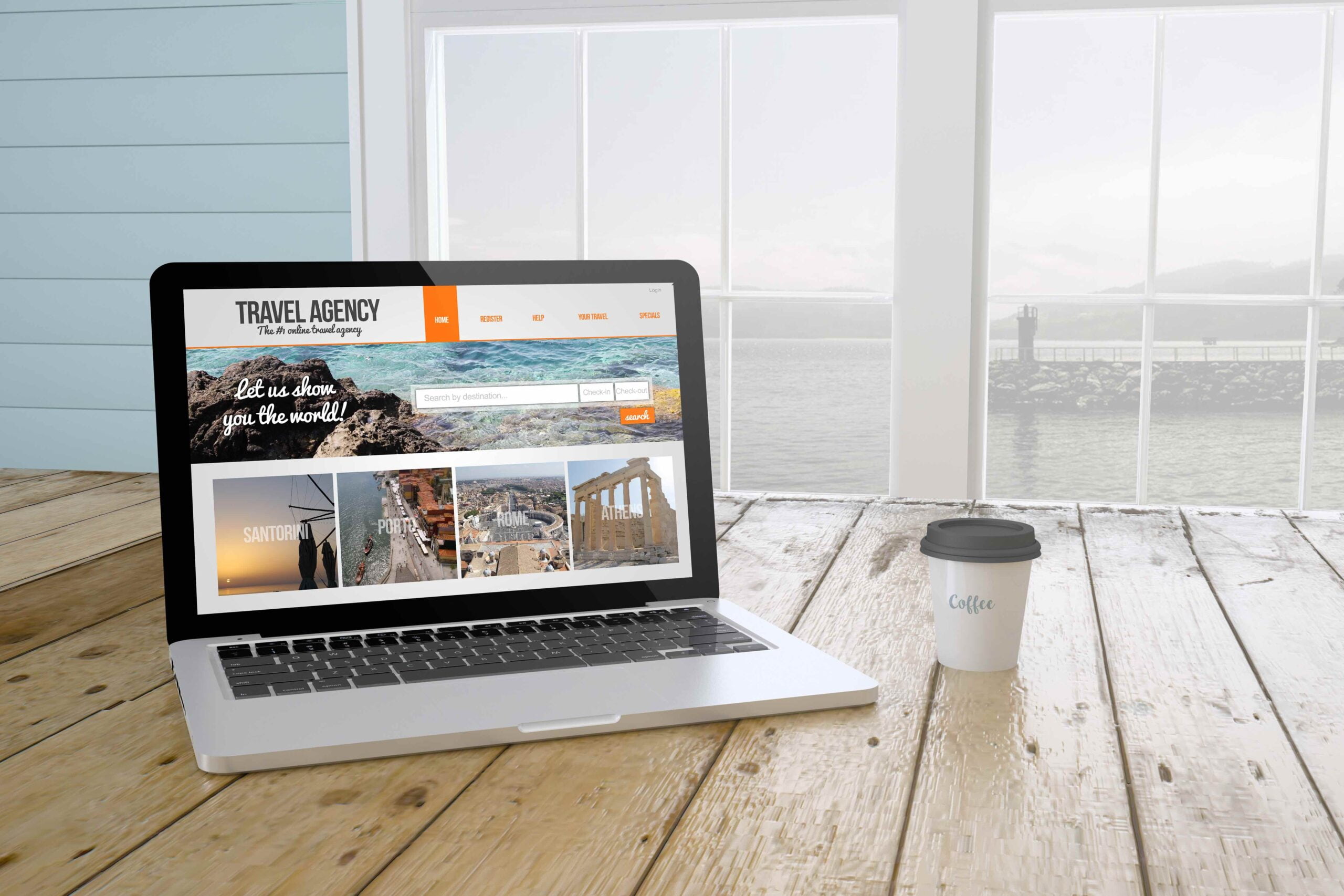
Are you stuck in the endless loop of designing landing pages that just don’t quite work? Don’t worry, we’ve all been there! In this blog post, our team will be giving you a walkthrough on designing landing pages that convert. We’ll go through the latest design trends and best practices to ensure your visitors have an enjoyable journey — starting from their initial click until they reach conversion success. So let’s get started today as we take a dive into converting those clicks into real results!
5 Ways to Optimize Your Landing Pages for Maximum Conversion
You’ve spent countless hours perfecting your website, from the design to the content. But let’s be real: your landing page is where the real magic happens. It’s the gateway to converting visitors into customers. That’s why it’s essential to optimize it to the max. You don’t want to lose potential customers because of a lackluster landing page. We’ve got you covered with these 5 winning ways to optimize your landing pages for maximum conversion. Get those click-throughs and watch your business soar!
Understand your Target Audience and Craft Messaging That Resonates With Them
Your marketing efforts will fall flat if you don’t understand your target audience. It’s essential to get inside the head of your customers and craft messaging that speaks directly to their needs and desires. This task doesn’t have to be daunting. With a bit of research and a sprinkle of creativity, you can make your message resonate with your audience. By speaking their language and addressing their pain points, you’ll strengthen their connection with your brand and ultimately drive more sales. So, whether you’re a small business owner or a marketing professional, take the time to get to know your target audience and create messaging that shines. You got this!
Keep the Design Simple With Clear Call-to-Actions
Design is not just about making things look pretty – it’s about effectively conveying a message to your audience. That’s why keeping your design simple while including clear call-to-actions is the key to success. Think of it like creating a map – you want to guide your users in a clear and concise way, without overwhelming them with unnecessary information or confusing road signs. So ditch the clutter and focus on what really matters – getting your message across. Remember, the best call-to-actions are the ones that make people want to take action, so keep it catchy and engaging. With the right design, your message will be sure to stand out in a crowded digital landscape.
Use Compelling Headlines to Grab Attention
Let’s face it, in today’s fast-paced world, we’re all guilty of scrolling through content at lightning speed. With so many articles, videos, and social media posts out there, how do you grab someone’s attention and make them stop and actually read what you’ve written? The answer lies in the power of a compelling headline. Your headline has the ability to make or break your content, so it’s essential that you put some time and effort into crafting something that really packs a punch. Think of it like a first impression – you want it to be memorable, engaging, and leave your reader wanting more. So, unleash your inner wordsmith and get creative with those headlines – your readers will thank you for it!
Highlight What Makes You Unique with Visuals
We’ve all heard the saying “a picture is worth a thousand words,” but what about a hundred pictures? Or better yet, a hundred pictures that showcase what makes you unique? In today’s visual-driven world, standing out from the crowd is more important than ever. That’s why we’re encouraging you to highlight what makes you stand out with visuals. Maybe it’s your love for exotic travel destinations or your impressive collection of vintage vinyl records. Whatever it may be, put it on display for the world to see. Plus, showcasing your unique qualities visually not only captures attention, but it also gives a glimpse into your personality and interests. So, don’t be afraid to get creative – use photos, drawings, or even videos to highlight your one-of-a-kind self. The sky’s the limit!
Incorporate Social Proof to Increase Relevancy & Trustworthiness
Picture this: You’re scrolling through an e-commerce site and stumble upon a product that catches your eye. You start to read the description and contemplate hitting that “Buy Now” button. But wait, how do you know this product is actually worth your hard-earned money? Cue social proof. Incorporating social proof into your website not only increases relevancy but also builds trustworthiness with potential customers. By showcasing reviews, testimonials and social media proof, you’re giving consumers a glimpse into how others have interacted with your brand or products. Plus, who doesn’t love a good recommendation from a fellow shopper? So, embrace the power of social proof and watch as your conversions and customer loyalty soar.
Summary
Taking the time to optimize your landing page can make all the difference when it comes to landing conversions and driving leads. Catching potential customers’ eyes with a persuasive visual, targeting the right audience, and setting out an irresistible call-to-action are all essential steps to take in order to maximize your conversions. Follow our tips, and you’ll quickly become an expert in creating landing pages that keep people coming back for more! And just remember: there’s a lot of room for creativity and experimenting with techniques, so go ahead and unleash your inner marketer – good luck!


